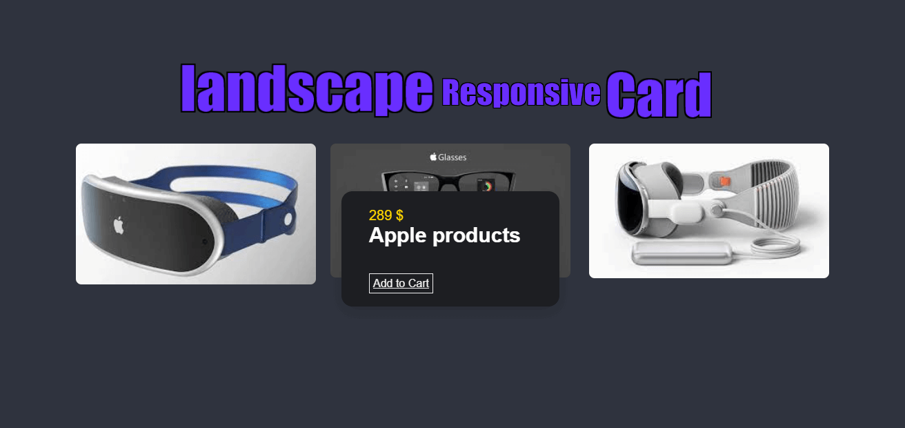
Create Landscape Responsive Card With
HTML & CSS
Video Tutorial of Landscape Responsive Card
Landscape Responsive Card [Source Codes]
To Create Landscape Responsive Card with HTML and CSS, follow the given steps line by line:
Create a folder. You can name this folder whatever you want, and inside this folder, create the mentioned files.
Create an index.html file. The file name must be index and its extension .html
Create a style.css file. The file name must be style and its extension .css
Once you create these files, paste the given codes into the specified files. If you don’t want to do these then scroll down and download the source code by clicking download button.
First, paste the following codes into your index.html file
<!DOCTYPE html>
   <html lang="en">
   <head>
      <meta charset="UTF-8">
      <link rel="stylesheet" href="styles.css">

      <title>Landscape responsive card</title>
   </head>
   <body>
      <div class="container">
         <div class="card_container">
            <article class="card_article">
               <img src="1.png" alt="image" class="card_img">
               <div class="card_data">
                  <span class="card_prize">349 $</span>
                  <h2 class="card_title"> Apple products </h2>
                  <a href="#" class="card_button">Add to Cart</a>
               </div>
            </article>

            <article class="card_article">
               <img src="2.png" alt="image" class="card_img">

               <div class="card_data">
                  <span class="card_prize">289 $</span>
                  <h2 class="card_title">Apple products </h2>
                  <a href="#" class="card_button">Add to Cart</a>
               </div>
            </article>

            <article class="card_article">
               <img src="3.png" alt="image" class="card_img">

               <div class="card_data">
                  <span class="card_prize">399 $</span>
                  <h2 class="card_title">Apple products </h2>
                  <a href="#" class="card_button">Add to Cart</a>
               </div>
            </article>
         </div>
      </div>
   </body>
</html>
Now paste the following codes into your style.css file
* {
  box-sizing: border-box;
  padding: 0;
  margin: 0;
}

body {
  background-color: #2F333E;
  color:#fff;
  font-family: Arial, sans-serif;
}

img {
  display: block;
  max-width: 420px;
  width: 100%;
  height: auto;
}
.container {
  display: grid;
  place-items: center;
}

.card_container {
  display: grid;
  row-gap: 4rem;
}

.card_article {
  position: relative;
  overflow: hidden;
}

.card_img {
  width: 420px;
  border-radius:.5rem;
}

.card_data {
  width: 280px;
  background-color: #1D1E22;
  padding: 1.5rem 1rem;
  box-shadow: 0 8px 24px hsla(0, 0%, 0%, .15);
  border-radius: 1rem;
  position: absolute;
  bottom: -9rem;
  left: 0;
  right: 0;
  margin-inline: auto;
  opacity: 0;
  transition: opacity 1s 1s;
}

.card_prize {
  display:#000;
  font-size: 20px;
  margin-bottom: 1.5rem;
  color: gold;
}

.card_title {
  font-size: 30px;
  font-weight: 600;
  margin-bottom: 2.75rem;
}

.card_button {
  text-decoration: bold;
  color: #f1f1f1;
  border: 1px solid;
  padding: 5px;
  margin-top: 15px;
}

.card_button:hover {
  background-color: #fff;
  color: #000;
}

.card_article:hover .card_data {
  animation: show-data 1s forwards;
  opacity: 1;
  transition: opacity .3s;
}

.card_article:hover {
  animation: remove-overflow 2s forwards;
}

.card_article:not(:hover) {
  animation: show-overflow 2s forwards;
}

.card_article:not(:hover) .card_data {
  animation: remove-data 1s forwards;
}

@keyframes show-data {
  50% {
    transform: translateY(-10rem);
  }
  100% {
    transform: translateY(-7rem);
  }
}

@keyframes remove-overflow {
  to {
    overflow: initial;
  }
}

@keyframes remove-data {
  0% {
    transform: translateY(-7rem);
  }
  50% {
    transform: translateY(-10rem);
  }
  100% {
    transform: translateY(.5rem);
  }
}

@keyframes show-overflow {
  0% {
    overflow: initial;
    pointer-events: none;
  }
  50% {
    overflow: hidden;
  }
}

@media screen and (min-width: 768px) {
  .card_container {
    grid-template-columns: repeat(2, 1fr);
    column-gap: 1.5rem;
  }
}

@media screen and (min-width: 1120px) {
  .container {
    height: 100vh;
  }

  .card_container {
    grid-template-columns: repeat(3, 1fr);
  }
  .card_img {
    width: 348px;
  }
  .card_data {
    width: 316px;
    padding-inline: 2.5rem;
  }
}
If you face any difficulties while creating your Landscape Responsive Card or your code is not working as expected, you can download the source code files by clicking on the download button.
Related post
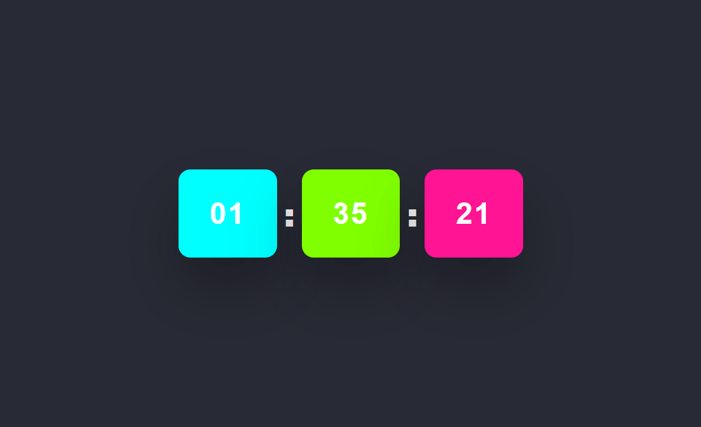 Build a Digital Clock using HTML CSS and JavaScript
onlinefindout
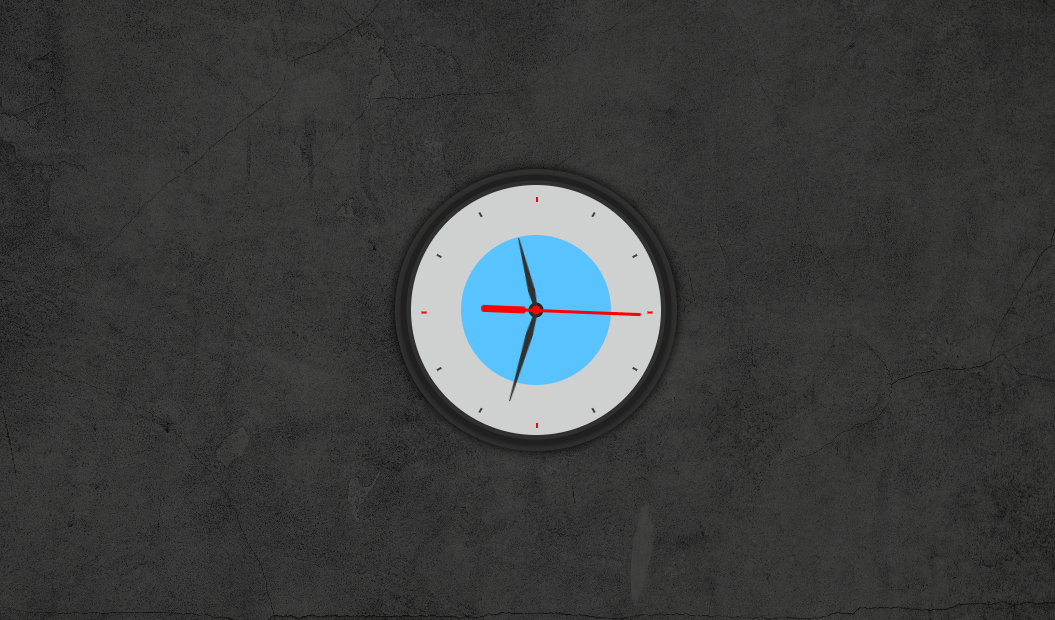 Analog Clock using HTML CSS and JavaScript
onlinefindout
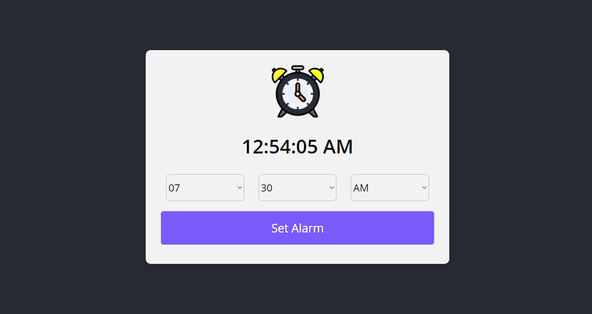 Create Alarm Clock with HTML CSS and JavaScript