How to Make a Sidebar Menu with HTML
CSS & JavaScript
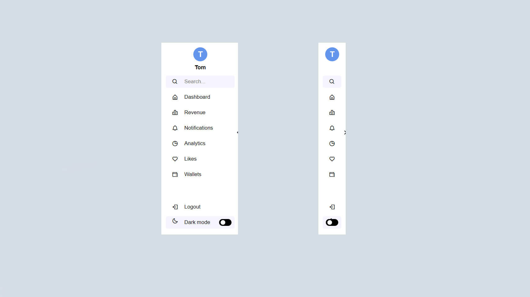
In simple words, a sidebar is usually a set-up column that is put into the left or right of the webpage's main website. They are usually used for displaying different types of additional information for users like: Email sign up forms. Navigational links to key pages.
Sidebar Menu in HTML CSS & JavaScript | Video Tutorial
Sidebar Menu [Source Codes]
To create Sidebar Menu with HTML CSS and JavaScript, follow the given steps line by line:
Create a folder. You can name this folder whatever you want, and inside this folder, create the mentioned files.
Create an index.html file. The file name must be index and its extension .html
Create a style.css file. The file name must be style and its extension .css
Create a script.js file. The file name must be style and its extension .js
Once you create these files, paste the given codes into the specified files. If you don’t want to do these then scroll down and download the source code by clicking on the download button.
First, paste the following codes into your index.html file
- <!DOCTYPE html>
- <html lang="en">
- <head>
- <meta charset="UTF-8">
- <meta name="viewport" content="width=device-width, initial-scale=1.0">
- <link rel="stylesheet" href="style.css">
- <link href='https://unpkg.com/boxicons@2.1.1/css/boxicons.min.css' rel='stylesheet'>
- <title>Sidebar Menu</title>
- </head>
- <body>
- <nav class="sidebar close">
- <header>
- <div class="logo-text">
- <span class="logo">T</span>
-
- <div class="text logo-text">
- <span class="name">Tom</span>
- </div>
- </div>
- <i class='bx bx-chevron-right toggle'></i>
- </header>
-
- <div class="menu-bar">
- <div class="menu">
- <li class="search-box">
- <i class='bx bx-search icon'></i>
- <input type="text" placeholder="Search...">
- </li>
- <ul class="menu-links">
- <li class="nav-link">
- <a href="#">
- <i class='bx bx-home-alt icon' ></i>
- <span class="text nav-text">Dashboard</span>
- </a>
- </li>
-
- <li class="nav-link">
- <a href="#">
- <i class='bx bx-bar-chart-alt-2 icon' ></i>
- <span class="text nav-text">Revenue</span>
- </a>
- </li>
-
- <li class="nav-link">
- <a href="#">
- <i class='bx bx-bell icon'></i>
- <span class="text nav-text">Notifications</span>
- </a>
- </li>
-
- <li class="nav-link">
- <a href="#">
- <i class='bx bx-pie-chart-alt icon' ></i>
- <span class="text nav-text">Analytics</span>
- </a>
- </li>
-
- <li class="nav-link">
- <a href="#">
- <i class='bx bx-heart icon' ></i>
- <span class="text nav-text">Likes</span>
- </a>
- </li>
-
- <li class="nav-link">
- <a href="#">
- <i class='bx bx-wallet icon' ></i>
- <span class="text nav-text">Wallets</span>
- </a>
- </li>
-
- </ul>
- </div>
-
- <div class="bottom-content">
- <li class="">
- <a href="#">
- <i class='bx bx-log-out icon' ></i>
- <span class="text nav-text">Logout</span>
- </a>
- </li>
-
- <li class="mode">
- <div class="sun-moon">
- <i class='bx bx-moon icon moon'></i>
- <i class='bx bx-sun icon sun'></i>
- </div>
- <span class="mode-text text">Dark mode</span>
-
- <div class="toggle-switch">
- <span class="switch"></span>
- </div>
- </li>
-
- </div>
- </div>
-
- </nav>
-
- <section class="home">
- <div class="text">Sidebar Dashboard </div>
- <p>Lorem ipsum dolor sit amet, consectetur adipiscing elit, sed do eiusmod tempor incididunt ut labore et dolore magna aliqua. Ut enim ad minim veniam, quis nostrud exercitation ullamco laboris nisi ut aliquip ex ea commodo consequat.</p> <br>
- <p>Lorem ipsum dolor sit amet, consectetur adipiscing elit, sed do eiusmod tempor incididunt ut labore et dolore magna aliqua. Ut enim ad minim veniam, quis nostrud exercitation ullamco laboris nisi ut aliquip ex ea commodo consequat.</p> <br>
- <p>Lorem ipsum dolor sit amet, consectetur adipiscing elit, sed do eiusmod tempor incididunt ut labore et dolore magna aliqua. Ut enim ad minim veniam, quis nostrud exercitation ullamco laboris nisi ut aliquip ex ea commodo consequat.</p> <br>
- <p>Lorem ipsum dolor sit amet, consectetur adipiscing elit, sed do eiusmod tempor incididunt ut labore et dolore magna aliqua. Ut enim ad minim veniam, quis nostrud exercitation ullamco laboris nisi ut aliquip ex ea commodo consequat.</p> <br>
- <p>Lorem ipsum dolor sit amet, consectetur adipiscing elit, sed do eiusmod tempor incididunt ut labore et dolore magna aliqua. Ut enim ad minim veniam, quis nostrud exercitation ullamco laboris nisi ut aliquip ex ea commodo consequat.</p> <br>
- <p>Lorem ipsum dolor sit amet, consectetur adipiscing elit, sed do eiusmod tempor incididunt ut labore et dolore magna aliqua. Ut enim ad minim veniam, quis nostrud exercitation ullamco laboris nisi ut aliquip ex ea commodo consequat.</p> <br>
- <p>Lorem ipsum dolor sit amet, consectetur adipiscing elit, sed do eiusmod tempor incididunt ut labore et dolore magna aliqua. Ut enim ad minim veniam, quis nostrud exercitation ullamco laboris nisi ut aliquip ex ea commodo consequat.</p> <br>
- <p>Lorem ipsum dolor sit amet, consectetur adipiscing elit, sed do eiusmod tempor incididunt ut labore et dolore magna aliqua. Ut enim ad minim veniam, quis nostrud exercitation ullamco laboris nisi ut aliquip ex ea commodo consequat.</p> <br>
- <p>Lorem ipsum dolor sit amet, consectetur adipiscing elit, sed do eiusmod tempor incididunt ut labore et dolore magna aliqua. Ut enim ad minim veniam, quis nostrud exercitation ullamco laboris nisi ut aliquip ex ea commodo consequat.</p> <br>
- <p>Lorem ipsum dolor sit amet, consectetur adipiscing elit, sed do eiusmod tempor incididunt ut labore et dolore magna aliqua. Ut enim ad minim veniam, quis nostrud exercitation ullamco laboris nisi ut aliquip ex ea commodo consequat.</p>
- </section>
- <script src="script.js"></script>
- </body>
- </html>
Now paste the following codes into your style.css file
- *{
- margin: 0;
- padding: 0;
- box-sizing: border-box;
- font-family: Arial, sans-serif;
- }
- body{
- min-height: 100vh;
- background-color: #E4E9F7;;
- transition:all 0.3s ease;
- }
-
- ::selection{
- background-color: #FFF;
- color: #fff;
- }
-
- body.dark{
- --body-color: #18191a;
- --sidebar-color: #242526;
- --primary-color: #3a3b3c;
- --primary-color-light: #3a3b3c;
- --toggle-color: #000;
- --text-color: #ccc;
- }
-
- .sidebar{
- position: fixed;
- top: 0;
- left: 0;
- height: 100%;
- width: 250px;
- padding: 10px 14px;
- background:#FFF;
- transition: all 0.3s ease;
- z-index: 100;
- }
- .sidebar.close{
- width: 88px;
- }
-
- .sidebar li{
- height: 40px;
- list-style: none;
- display: flex;
- align-items: center;
- margin-top: 10px;
- }
-
- .sidebar header,
- .sidebar .icon{
- min-width: 60px;
- border-radius: 6px;
- }
-
- .sidebar .icon{
- min-width: 60px;
- border-radius: 6px;
- height: 100%;
- display: flex;
- align-items: center;
- justify-content: center;
- font-size: 20px;
- }
-
- .sidebar .text,
- .sidebar .icon{
- color: #000;
- transition: all 0.2s ease;
- }
-
- .sidebar .text{
- font-size: 17px;
- font-weight: 500;
- white-space: nowrap;
- opacity: 1;
- }
- .sidebar.close .text{
- opacity: 0;
- }
-
- .sidebar header{
- position: relative;
- }
-
- .sidebar header .logo-text{
- display: flex;
- align-items: center;
- margin-bottom: -20px;
- }
- .sidebar header .logo-text{
- display: flex;
- flex-direction: column;
- }
- header .name {
- margin: 5px;
- font-size: 18px;
- font-weight: 600;
- }
-
- .logo {
- width: 45px;
- height: 45px;
- border-radius: 50%;
- background: cornflowerblue;
- color: #fff;
- font-size: 25px;
- text-align: center;
- font-weight: 600;
- margin: 5px; /* Note: This margin property contradicts margin-top; adjust accordingly */
- line-height: 45px;
- display: flex;
- align-items: center;
- justify-content: center;
- }
-
-
- .sidebar header .image img{
- width: 40px;
- border-radius: 6px;
- }
-
- .sidebar header .toggle{
- position: absolute;
- top: 280px;
- right: -25px;
- transform: translateY(-50%) rotate(180deg);
- height: 25px;
- width: 25px;
- background-color: #FFF;
- color:#000;
- border-radius: 50%;
- display: flex;
- align-items: center;
- justify-content: center;
- font-size: 28px;
- cursor: pointer;
- transition: all 0.3s ease;
- }
-
- body.dark .sidebar header .toggle{
- color: #000000;
- }
-
- .sidebar.close .toggle{
- transform: translateY(-50%) rotate(0deg);
- }
-
- .sidebar .menu{
- margin-top: 40px;
- }
-
- .sidebar li.search-box{
- border-radius: 6px;
- background-color:#F6F5FF;
- cursor: pointer;
- transition: all 0.3s ease;
- }
-
- .sidebar li.search-box input{
- height: 100%;
- width: 100%;
- outline: none;
- border: none;
- background-color: #F6F5FF;
- color: #000000;
- border-radius: 6px;
- font-size: 17px;
- font-weight: 500;
- transition: all 0.3s ease;
- }
- .sidebar li a{
- list-style: none;
- height: 100%;
- background-color: transparent;
- display: flex;
- align-items: center;
- height: 100%;
- width: 100%;
- border-radius: 6px;
- text-decoration: none;
- transition: all 0.2s ease;
- }
-
- .sidebar li a:hover {
- box-shadow: 0 -4px 8px rgba(0, 0, 0, 0.1),
- 0 4px 8px rgba(0, 0, 0, 0.1);
- background-color: #FFF;
- color: black;
- transition: box-shadow 0.3s ease-in-out, background-color 0.3s ease-in-out;
- }
-
- .sidebar li a:hover .icon,
- .sidebar li a:hover .text{
- color: #000000;
- }
- body.dark .sidebar li a:hover .icon,
- body.dark .sidebar li a:hover .text{
- color:#000000;
- }
- p{
- margin-left: 60px;
- }
- .sidebar .menu-bar{
- height: calc(100% - 55px);
- display: flex;
- flex-direction: column;
- justify-content: space-between;
- overflow-y: scroll;
- }
- .menu-bar::-webkit-scrollbar{
- display: none;
- }
- .sidebar .menu-bar .mode{
- border-radius: 6px;
- background-color:#F6F5FF;
- position: relative;
- transition:all 0.3s ease;
- }
-
- .menu-bar .mode .sun-moon{
- height: 50px;
- width: 60px;
- }
-
- .mode .sun-moon i{
- position: absolute;
- }
- .mode .sun-moon i.sun{
- opacity: 0;
- }
- body.dark .mode .sun-moon i.sun{
- opacity: 1;
- }
- body.dark .mode .sun-moon i.moon{
- opacity: 0;
- }
-
- .menu-bar .bottom-content .toggle-switch{
- position: absolute;
- right: 0;
- height: 100%;
- min-width: 60px;
- display: flex;
- align-items: center;
- justify-content: center;
- border-radius: 6px;
- cursor: pointer;
- }
- .toggle-switch .switch{
- position: relative;
- height: 22px;
- width: 40px;
- border-radius: 25px;
- background-color: black;
- transition: all 0.3s ease;
- }
-
- .switch::before{
- content: '';
- position: absolute;
- height: 15px;
- width: 15px;
- border-radius: 50%;
- top: 50%;
- left: 5px;
- transform: translateY(-50%);
- background-color: #FFF;
- transition: all 0.3s ease;
- }
-
- body.dark .switch::before{
- left: 20px;
- }
-
- .home{
- position: absolute;
- top: 0;
- top: 0;
- left: 250px;
- height: 100vh;
- width: calc(100% - 250px);
- background-color: #E4E9F7;;
- transition: all 0.3s ease;
- }
- .home .text{
- font-size: 30px;
- font-weight: 500;
- color: #000000;
- padding: 12px 60px;
- }
-
- .sidebar.close ~ .home{
- left: 78px;
- height: 100vh;
- width: calc(100% - 78px);
- }
- body.dark .home .text{
- color: #000000;
- }
Now paste the following codes into your script.js file
- document.addEventListener("DOMContentLoaded", function() {
- const body = document.querySelector('body');
- const sidebar = body.querySelector('nav');
- const toggle = body.querySelector(".toggle");
- const modeSwitch = body.querySelector(".toggle-switch");
- const modeText = document.querySelector(".mode-text");
- const searchBtn = document.querySelector(".search-box");
-
- toggle.addEventListener("click", () => {
- sidebar.classList.toggle("close");
- });
-
- searchBtn.addEventListener("click", () => {
- sidebar.classList.remove("close");
- });
-
- modeSwitch.addEventListener("click", () => {
- body.classList.toggle("dark");
-
- if (body.classList.contains("dark")) {
- modeText.innerText = "Light mode";
- } else {
- modeText.innerText = "Dark mode";
- }
- });
- });
-
If you face any difficulties while creating your Sidebar Menu or your code is not working as expected, you can download the source code files for this Sidebar Menu by clicking on the download button.
Related post
 OTP verification form
with HTML,CSS and JavaScript
OTP verification form
with HTML,CSS and JavaScript
onlinefindout
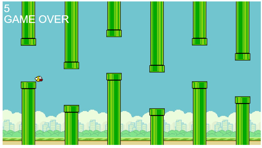 Flappy Bird Game Clone with HTML
CSS and JavaScript
Flappy Bird Game Clone with HTML
CSS and JavaScript
onlinefindout
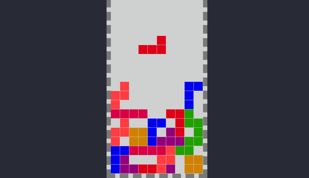 Tetris Game with HTML CSS and JavaScript