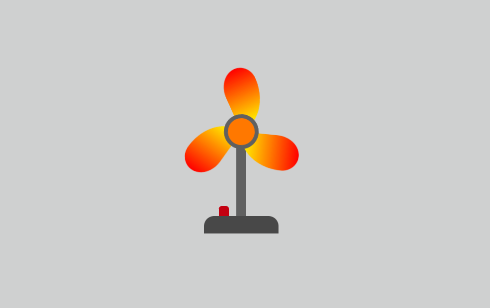
Create a Animated Fan using HTML & CSS
Video Tutorial of Animated CSS Fan
Animated Fan [Source Codes]
To Create Animated Fan with HTML and CSS, follow the given steps line by line:
Create a folder. You can name this folder whatever you want, and inside this folder, create the mentioned files.
Create an index.html file. The file name must be index and its extension .html
Create a style.css file. The file name must be style and its extension .css
Once you create these files, paste the given codes into the specified files. If you don’t want to do these then scroll down and download the source code by clicking download button.
First, paste the following codes into your index.html file
- <!DOCTYPE html>
- <html lang="en">
- <head>
- <title>Working Fan CSS</title>
- <!--Stylesheet-->
- <link rel="stylesheet" href="style.css">
- </head>
- <body>
- <div class="fan">
- <input type="checkbox" id="btn">
- <label for="btn">
- <span></span>
- <span></span>
- <span></span>
- </label>
- <div class="base"></div>
- </div>
- </body>
- </html>
Now paste the following codes into your style.css file
- *,
- *:before,
- *:after{
- padding: 0;
- margin: 0;
- box-sizing: border-box;
- }
- body{
- background: #CFD0D0;
- }
- .fan{
- height: 350px;
- width: 350px;
- position: absolute;
- margin: auto;
- top: 0;
- bottom: 0;
- left: 0;
- right: 0;
- }
- label{
- display: block;
- height: 20px;
- width: 20px;
- background-color: #606060;
- position: absolute;
- margin: 120px auto 0 auto;
- left: 0;
- right: 0;
- border-radius: 50%;
- animation: spin 1s infinite linear;
- animation-play-state: paused;
- }
- @keyframes spin{
- 100%{
- transform: rotate(360deg);
- }
- }
-
- label:after{
- content: "";
- position: absolute;
- height: 70px;
- width: 70px;
- background-color: #FF7800;
- border: 8px solid #606060;
- border-radius: 50%;
- left: -25px;
- bottom: -25px;
- }
- label span{
- display: block;
- height: 120px;
- width: 70px;
- background-image: linear-gradient(red, yellow);
- border-radius: 55% 45% 100% 0% / 39% 28% 72% 61%;
- position: absolute;
- z-index: -1;
- }
- span:nth-child(1){
- bottom: 10px;
- left: 10px;
- }
- span:nth-child(2){
- transform: rotate(-120deg);
- left: -95px;
- top: -50px;
- }
- span:nth-child(3){
- transform: rotate(-240deg);
- right: -60px;
- top: 10px;
- }
- .base{
- height: 160px;
- width: 20px;
- background-color: #606060;
- position: absolute;
- margin: auto;
- left: 0;
- right: 0;
- top: 140px;
- z-index: -1;
- }
- .base:after{
- content: "";
- position: absolute;
- height: 35px;
- width: 150px;
- background-color: #484848;
- left: -65px;
- top: 160px;
- border-radius: 20px 20px 0 0;
- }
- input[type="checkbox"]{
- position: absolute;
- -webkit-appearance: none;
- appearance: none;
- height: 20px;
- width: 20px;
- background-color: #c30010;
- position: absolute;
- bottom: 50px;
- left: 130px;
- outline: none;
- cursor: pointer;
- border-radius: 5px 5px 0 0;
- }
- input[type="checkbox"]:checked{
- height: 10px;
- }
- input[type="checkbox"]:checked + label{
- animation-play-state: running;
- }
If you face any difficulties while creating your Animated Fan or your code is not working as expected, you can download the source code files by clicking on the download button.
Related post
 Simple Image Editor in JavaScript
onlinefindout
 Sidebar Menu with HTML
CSS & JavaScript
Sidebar Menu with HTML
CSS & JavaScript
onlinefindout
 QR Code Scanner with HTML,CSS and JavaScript